Custom Designed Catering Website
Catering Website Design
What They Wanted
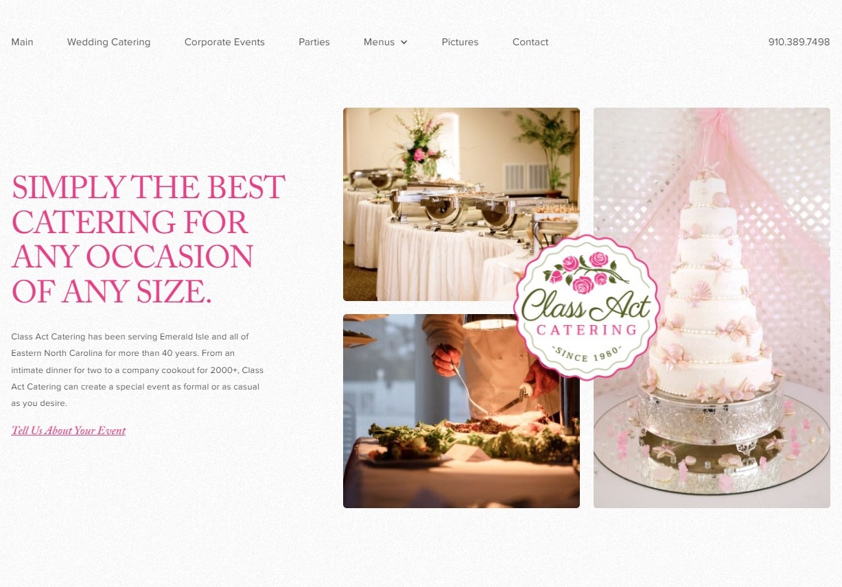
Phyllis Manning original website stopped working and she needed a sleek, modern design that highlighted her wonderful food with lots of beautiful pictures and animations.
What We Did
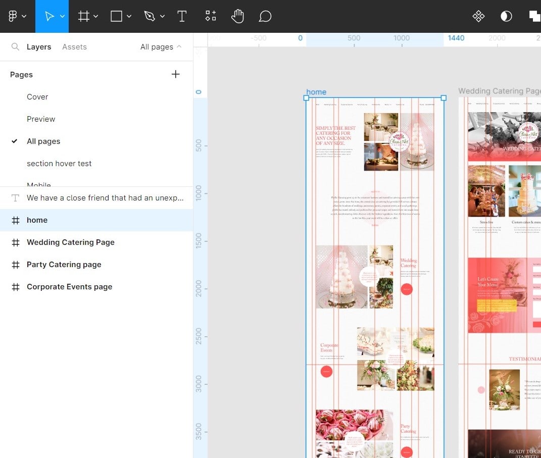
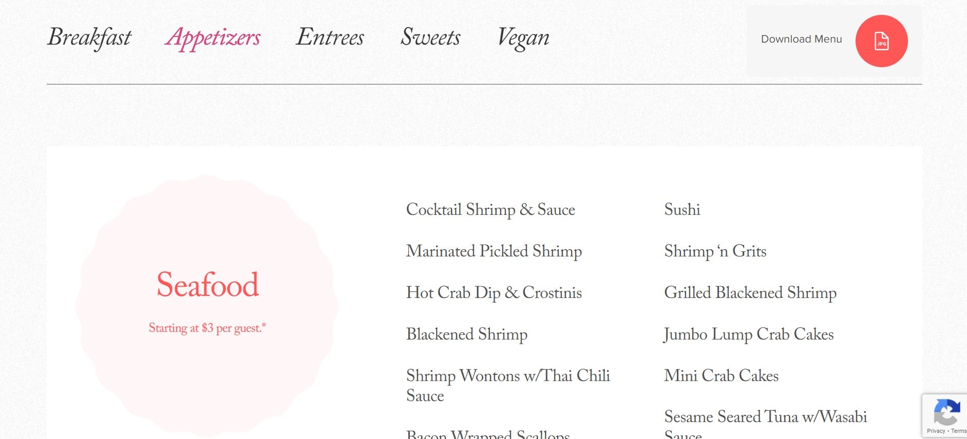
We knew Phyllis wanted everything involving her brand to reflect her drive and determination to be top notch. So Alex created a new color palette and used it to design a minimalist UI and several custom design layouts in Figma. Tim took the color palette and got to work on creating a new, fresh logo. Anthony presented everything to Phyllis and she made her choices. Afterward, the team focused on enhancing the designs until they were perfect. Alex did little things like optimizing all the images so that they load quickly across different devices, adding spam protection to the site's contact forms, and creating numerous custom animations and interactions.
What They Say
"testimonial"
Phyllis Manning


