
[EDIT 01/12/2017: Added link to Pearsonified’s fantastic typography tool!]
Admittedly, we have not always done well with the typography in our web designs and we are continually working at it. One area that does not have to be as difficult to get right is “measure” or the length of a line of type.
Ideally, the measure should be somewhere between 50 and 80 characters long. We have not always followed that, unfortunately, and anything longer than 80 starts to get difficult for the viewer to read. Even this post you are reading right now does not follow that rule perfectly. Hey, I am being honest here 🙂
To achieve a good measure, the designer should consider adjusting the font-size and Robert Bringhurst came up with a great formula for that: Multiply the font-size by 30 to give you the acceptable measure for each line (font-size X 30 = measure). For example, if your font size is to be 12px, a good measure would be 360px.
Additionally, you could take the size of space on your design that is to contain type and divide that by 30 (font container / 30 = measure) to give you a starting point. So if your design calls for a 500px area of type, your font-size would be 17px. That, of course, is just a starting point. No one would want to read a paragraph of 17px text – yikes. You would probably want to find some ways to adjust that area in your design (pullquotes, images, etc.) and the font size will be affected by the font style that you chose as well.
 EDIT: Chris Pearson created this awesome tool that helps you get the perfect typography for your design. Simply enter the font size and content width and *poof* magic. If you’re doing a custom design, check it out. If you’re using web design templates (shudder), someone else has probably already done the hard work for you haha.
There are many rules and suggestions regarding typography in your design. This is just one area and we are going to try to post some other tips as we pick them up. We have found some really great guides and articles out there and will be compiling them into a post.
Recent Posts
In Web Design
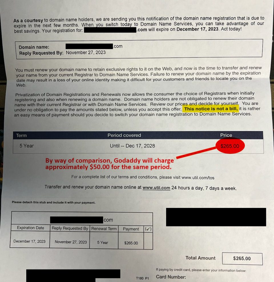
Domain Name Services Scam - Kind of
Jan 12, 2017
"The measure in a paragraph should be easy for the visitor to read." Robert Bringhurst had a great formula which can give you a good starting point f...

Web Design Basics
Jan 12, 2017
"The measure in a paragraph should be easy for the visitor to read." Robert Bringhurst had a great formula which can give you a good starting point f...

Three Common Web Design Mistakes
Jan 12, 2017
"The measure in a paragraph should be easy for the visitor to read." Robert Bringhurst had a great formula which can give you a good starting point f...