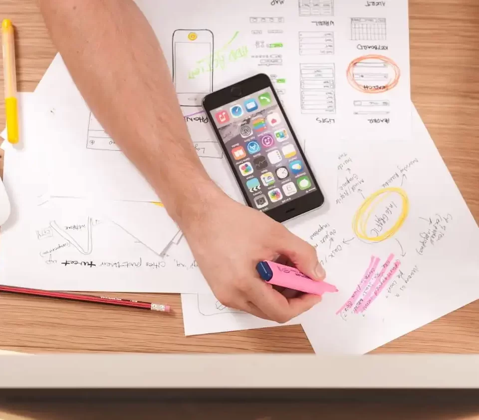
In the world of website design, Morehead City NC businesses benefit from understanding the basics. A well-designed website blends aesthetic appeal with functionality, ensuring it is responsive and easy to navigate. Key elements include intuitive user interfaces, mobile-friendly layouts, and fast loading speeds. Choosing a web design service in Morehead City NC that prioritizes these aspects can significantly enhance your online presence. Whether you’re establishing a new site or revamping an existing one, mastering these fundamentals ensures a superior user experience and better business outcomes.
Professional web design has become vital during recent years. A few years ago, it was estimated that a visitor to a web site took about 8 seconds to decide to stay on that web site or click the “Back” button. That was then, this is now: Your web site has only about 2 seconds to make an impression on the visitor. That is not much time at all! Today, people want instant results. Few people even wait to see the entire web design before making their decision. If your web design does not grab their attention immediately, they won’t stick around. And if your web site does not offer something of benefit, they won’t bookmark it and they won’t come back (more on that later).
So, with that in mind, let’s discuss some practical ways your web design can grab the attention of your visitors. Then, in a future article, we will talk a little about keeping their attention with good web site content. Remember, people spend most of their time on the Internet reading. They read search results, news items, how-to articles and forums. A professional web design company will take this into account. But that is for later. First, we have to keep visitors attention (remember the 4 second rule).
Get to the Point
We live in a fast-paced society and we are used to instant results: Microwave meals in 2 minutes, lose 5 pounds in 5 days, 10 minute oil changes, see results from fitness equipment in 20 minutes a day, and on and on.
The Internet is no different and it is actually less forgiving of poor web designs that don’t deliver results quickly.
The 2 second rule that we spoke of earlier does not mean that the entire web page must load in 2 seconds. Rather, it means that a visitor to your web site has to at least see something interesting within that 2 second window. So, to test your site, while it is loading, ask yourself:
- How much time passes before I see anything?
- What is the first thing I see on the web page?
- How much time passes before I can read some text?
- How long would it take a visitor to determine what the web site is about?
Try this suggestion yourself and then enlist the help of some of your friends. The more people you have to test your web site, the more thorough your results will be.
Ideally, the site should load top to bottom and left to right. However, your design should adhere to the reading habits of your target audience. Some countries read from right to left so, make sure you know your audience. Also, the most eye-catching elements should load first. Once these load and grab the visitor’s attention, the rest of the page can finish loading.
What Graphics Format Should I Use?
This is probably one of the most overlooked aspects of web design. How many times have you visited a web site and cringed at the slow loading pictures. I’ll bet you did not stick around to see everything load.
In most cases, web sites that have this problem were created by someone who bought a Web Design How-To book, created a web page that says “Hello World” and now think they are an expert. Or, while learning web design, they created this slow loading site as a favor for a friend or family member. At any rate, hiring a professional web design company will prevent bad design from happening to you. In the meantime, here are some very basic guidelines regarding those common web site graphics:
More about the .JPG file format
.JPG (Joint Photographic Experts Group) format allows images to contain up to 16 million colors. It also supports Variable Compression, which allows you to reduce the size of the image at the cost of some of the detail. In order to take full advantage of this feature, you will need a graphics program which will allow you to preview the image after you have compressed it. Some of the more popular graphics programs are Photoshop, Fireworks and Corel Paintshop.
.JPG is not a good format for images with only a few colors or for text created as an image. The finished image will be of poor quality.
More about the .GIF file format
.GIF (Graphics Interchange Format) support up to 256 colors. It also supports “transparency” which allows you to specify the background of the image to be invisible, thereby letting the web page colors show through.
Graphics in this format are also “looseless”, meaning the final quality is not adversely affected by compressing.
Boiling it Down
For the most part, here is a good way to determine what format you should use for the graphics on your web site:
- If your graphic has many colors (such as a photo) use .JPG as the format, However, make sure that the file size is not so large that it prevents the web page from loading quickly. Find a good balance between image quality and file size.
- If your graphic has only a few colors (such as a chart) use .GIF as the format.
Of course, this is somewhat oversimplifying the very important role of graphics in your web site design. If you hire a professional web site designer to create your web presence, he or she should follow these guidelines during the design process. You should make sure that the rough drafts you receive from the designer adhere to good design standards.
EDIT: Since this post was first written back in 2007, there are TONS of new formats for graphics. We’ll do a future post on them but make sure you pay special attention to a new format called “WEBP”. It’s nice!
Make Them Want More
A great website captivates visitors and leaves them eager to explore further. With the expertise of a web designer in Swansboro, NC, your site can combine stunning visuals with intuitive navigation to create an unforgettable user experience. Crystal Coast Technologies specializes in crafting designs that highlight your brand’s uniqueness and keep visitors engaged. By focusing on both functionality and aesthetics, we help businesses build websites that encourage customers to stay longer, explore more, and return often.
Of course, no matter how well organized your web site is and how effective it is at grabbing the visitor’s attention, they have to view your web site as important. You have to give them reasons to stay and browse your site, to bookmark your site so they can refer to it again and to tell others about your site so you can build new visitors.
We will consider how to tackle this aspect of quality web site design in an upcoming article. That article will focus on three main ways to keep visitors coming back:
1. Offer something of value
Newsletter
Free tips
Monthly coupons
2. Good, quality marketing copy
Put effort into the words of your web site.
Remember, the Internet is made up of web pages and for the most part, pages are meant to be read.
3. Easy to use web site navigation.
If visitors can’t get around easily on your web site, they won’t stay very long.
We would love to talk to you about your web design needs and how we can help!. Please visit our web design contact form and we will get right back to you. If you want to see some of our logos, graphics, and web design work, click here. If you’re just looking for some free tips and software that you can try yourself, check out Free Internet Marketing Tips or Logo and Graphics Design tips.


